It’s one of our favorite events of the new year… Pantone’s color of the year!
For 23 years (and counting!) Pantone’s Color of the Year has had a huge impact and influence on a multitude of enterprises including the home design, fashion, art, and beauty industries (just to name a few!)
“The Pantone Color of the Year reflects what is taking place in our global culture, expressing what people are looking for that color can hope to answer.”
Laurie Pressman, Vice President Pantone Color Institute
As the design world’s leading color authority, Pantone gives it to us straight every year, while reflecting on societies, cultures, and economies around the globe. We’ve compiled a few of our favorites (and the latest!) Pantone-approved color trends over the past few years, as well as some pointers on how to include them in your space!
What Does Pantone Mean in Color?
So, let’s talk about Pantone, the superhero of colors. You’ve probably heard the term tossed around, but what exactly is it? Well, imagine it’s this massive color library with over 2,000 shades, each meticulously cataloged in the Pantone Matching System (PMS). And get this: the name “Pantone” comes from blending “Pan” (meaning All) and “Tone” (meaning Color). It’s like they’re saying, “We’ve got all the colors you could ever need, right here!”
Before Pantone, the color game was like the Wild West. Every printing company had its own take on what “blue” or “green” should look like. But then Pantone swooped in back in 1963, armed with a standardized system for color matching. Suddenly, designers could pick a shade of blue and know exactly how it would look on paper, whether coated, uncoated, or matte. Gone are the days of “What you see isn’t what you get”. Thanks to Pantone, it’s like we’ve got the keys to the kingdom of color consistency!
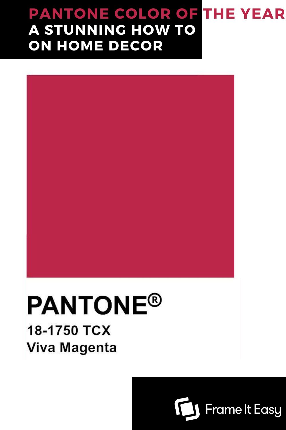
2023 Pantone Color – Viva Magenta

2023’s Pantone Color Of The Year is vibrant and rooted in nature: VIva Magenta. An expressive red hue that is most definitely about making a statement and standing tall in a crowd.
This deep yet lively shade is perfect for bringing some warmth or romance to a space. If you’re looking to add just a pop of color or go full force, we’ve got some tips on how to bring your space to life with Viva Magenta in 2023:
“In this age of technology, we look to draw inspiration from nature and what is real. Viva Magenta descends from the red family, and is inspired by the red of cochineal, one of the most precious dyes belonging to the natural dye family as well as one of the strongest and brightest the world has known. Rooted in the primordial, Viva Magenta reconnects us to original matter. Invoking the forces of nature, Viva Magenta galvanizes our spirit, helping us to build our inner strength.”
Leatrice Eiseman – Executive Director, Pantone Color Institute
Color Palettes
Wondering how to add this color to your space? We’ve put together a few color palettes to help fit this color in with already existing looks:

Paired with toned-down pinks and a smokey grey, this cool tone palette gives off rosey romantic vibes! Perfect for a powder room or a soft and elegant master bedroom.

Vibrant greens and yellows make this color palette pop with cheer! If you’re looking to add some fun and creativity to a funky art room or creative kitchen – this is your go-to!

Warming up a room is easy when paired with this butternut yellow and plum purple! Add warmth and welcome to your space with this palette, perfect for a dining area and lounge space.
Walls

This year’s color is pretty vibrant! If you’re brave enough to slap this color on all you’re walls – we salute you! 🫡
For those of you looking for an accent wall color, viva magenta will do just the trick. Consider painting a pattern on your wall if you’re not ready to commit to the purple powerhouse. A light gray or pink with Pantone Color Viva Magenta dots or lines on your accent wall would bring some personality and playfulness to any room. (This is also a great opportunity to create a staggered gallery wall to show off that art collection!)
Frames & Decor

If you’re slapping this Pantone color on your walls, might we suggest toning down the rest of your elements? Grabbing any one of our metal-style frames in gold or silver will still pack a punch – but won’t take away from Viva Magenta’s star power!

If you’re a risk taker or just really love color! Go crazy with a pop of pink – grab the Ashford-style frame in Hot Pink and pair it with a maroon or off-white mat board to keep the frame and art in focus.
Furniture
The great thing about this Pantone color shade is that it goes well with almost any neutral color. Stained wood, brick, and black vinyl dressers and tables can easily be worked in with this tone.
If you’re bringing in a neutral-toned couch, loveseat, or bed into the mix we recommend adding a throw pillow or blanket in the Viva Magenta shade to bring the room together.
Looking for a little more subtlety? Include a vintage glass vase to a table or bookshelf with dried roses or other red & pink flowers – while this isn’t the perfect Pantone color shade, it’s pretty dang close!

Pantone Color 2022 – Very Peri

2022’s Pantone Color Of The Year displays a carefree confidence and quite the personality! Representing the emergence from isolation into a changing world that blends with the digital and physical aspects of our lives.
Reminiscent of the late 90’s – early 2000’s pastel pop color, Very Peri has a ton of design potential in both big and small spaces alike. We’ve got some fresh ideas on how to take this bold color and confidently add it to any space!
“Encompassing the qualities of the blues, yet at the same time possessing a violet-red undertone, Very Peri displays a spritely, joyous attitude and dynamic presence that encourages courageous creativity and imaginative expression.”
Leatrice Eiseman – Executive Director, Pantone Color Institute
Color Palettes
You may be wondering how to adapt this color into your space, we’ve put together a few color palettes to help fit this color in with already existing looks:

Adding in more vibrant colors alongside Very Peri gives off youthful and playful properties. If you’re looking to redo a kid’s playroom or bedroom, this might be the perfect color choice!

Adding a blend of nature-inspired shades adds warmth and a sense of comfort, use this palette with small pops of Very Peri in a living room, den, or even a kitchen.

Balancing cool and warm tones can be a bit of a task, but with this palette, warm honey tones complement the vibrant hues of cool purple. Perfect for a relaxing bathroom or bedroom atmosphere.
Walls
Very Peri is the perfect color to bring into your bedroom or bathroom this year – resembling the calming effect of lavender flowers we can’t help but chill out when we see this shade!
While Very Peri is quite rich, you can still tone it down just a tad when applying it to your walls. By adding an off-white or cream-colored additive to your main paint you’ll still be able to create a trendy look without an overly vibrant wall!
Another great option is to look into wallpaper or wall stickers in this Pantone shade to add to bare walls – super trendy but without the commitment of paint!

Frames & Decor


We love 2022’s color of the year for its versatility! Mixing with blues and greys will keep the meditative and restorative mood in a room while adding pops of pink and red will add excitement and personality to a space.
If you’re looking to keep this year’s color the main focus we recommend adding any of our silver, black, or white picture frame colors to your space. Looking for a relaxing vibe? We recommend our wood frames – like the Dayton style in Whitewash. If you want some more excitement try one of our metal frames like the Hanover style in Gloss Silver.
Furniture

While you may be tempted to bring back that gloss purple blowup couch from the ’90s – we have some other suggestions…
- A Very Peri colored lava lamp
- Painted storage crates
- A beaded chandelier
These are just a few fun ideas to spark your creativity. Remember there’s nothing wrong with the old throw pillow and blanket to get that pop of trending color you’re looking for!
Free Neutral Pattern Poster Art!
Subscribe to our mailing list for exclusive goodies, fun quizzes, framing tips and tricks, and so much more!
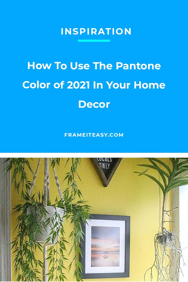
2021 – Ultimate Gray & Illuminating

We’re doubly excited because instead of just one color, this year we have two colors that represent the mood for 2021: Ultimate Gray (think somewhere between cinder blocks and cloudy skies) and Illuminating (think bright but not quite a highlighter yellow.) And while they may seem like they’re from opposite ends of the color spectrum, Pantone says that they come together to support one another, complement one another, and aspire to give us hope for a better year.
“The union of an enduring Ultimate Gray with the vibrant yellow Illuminating expresses a message of positivity supported by fortitude, practical and rock solid but at the same time warming and optimistic, this is a color combination that gives us resilience and hope. We need to feel encouraged and uplifted, this is essential to the human spirit.”
Leatrice Eiseman – Executive Director, Pantone Color Institute
While you can opt to use just one of these colors, we think adding a splash of each of them in your home might be just the look, and attitude needed for the year ahead. Of course, at Frame It Easy part of our motto is affordable, so the updates we have in mind don’t have to break the bank. We’re sharing some ways to add 2021’s colors into your space that are budget-friendly yet still powerful enough to transform your room (and your outlook!)
Statement Walls

Adding a statement wall to your room can bring it from wow to WOW. Of course, you don’t have to go all out and paint every wall Illuminating, but a single statement wall will draw attention instantly and brighten your surroundings. If you’re updating your bedroom, consider doing the wall behind your bed. A statement wall can be added to any room in your home, living room, kitchen, or even your bathroom! Think about which room a bright, sunny wall would work well in, and then get to work!
While we don’t have matting specifically named Ultimate Gray, we have several shades that would work just as well to get that uplifting combination Pantone is suggesting! Check out Gray, Mid Gray, Harbor, and Granite. And in case you decide to make Ultimate Gray your wall color, we think our Buttercup matting would be the perfect stand-in for Illuminating.
Furniture
Yes, we said we were going to talk about inexpensive ways to decorate, but just in case you’re in the market for some new furniture, consider a gray sofa or loveseat to invest in. It’s a great neutral color that will stand the test of time, long after it’s no longer the color of the year. If your space or budget doesn’t allow for it, consider painting an existing piece you already own. Maybe your coffee table has seen better days, or your counter barstools could use a makeover. Painting them is an affordable alternative to buying new.

Fabric

Decorative pieces aren’t the only way to add color. Throws, pillows, rugs, and bedspreads can all add some uplifting color to your space. A little fabric is sometimes all you need. Something as simple as placemats can accomplish the goal of making the two colors do their job of supporting one another.
With a little bit of internet searching, you can find lots of fabrics that combine the Ultimate Gray and Illuminating look. But don’t stress if you can’t find both colors in one fabric. Gray placemats and yellow napkins. Bright yellow bath towels with a gray bathmat. Alternating gray and yellow throw pillows. You get the picture! 🖼️
Decor Pieces
Don’t forget to add some touches of yellow and gray to your decor pieces. Candlesticks, vases, plates, artwork. Incorporating a touch of color can be fun and doesn’t have to be costly. Etsy, Amazon, and Home Goods are all great places to find bargains but don’t forget second-hand and thrift stores for some really great finds. Consider a new lamp for your desk or a new pot for your plants (whether they’re real or fake, we don’t judge 😉).

Frames

Of course, that being said, we at Frame It Easy think every good update deserves some new frames for your walls or tabletops! And as we said when we started, we are an affordable custom frame company, so once again you can update your space without breaking the bank.
If you have an empty wall in your home that you’ve been wanting to add something to, now is the perfect time to transform it into a grand display of your favorite photos. Gather some of your favorite family photos, travel spots, or photos of your furry friends and give them the display they deserve! Not only do we offer matboards that imitate Pantone’s colors, but both our wood and metal frames have several options that could qualify as the ultimate gray!
Final Thoughts
With a new year, comes new design trends. As always, we love to stay up to date with the latest fads and share them with you. No matter what color or shade you’re rockin’ – just make sure you love it! As we always say even if something isn’t “on trend” it doesn’t mean it’s not a great look. Always be true to yourself and your personal style!

Have A Pantone Color theme you want to show off? make sure to share your photos with us on social media so we can see what you came up with. If you have any ideas that we didn’t think of, share those too! We can’t wait to see your updated space!
Inspire others by sharing your photos, and tell us your story! If we share it, you’ll receive a coupon for 15% off your next order!