A great place to start when designing a space is by choosing home decor color schemes and color combinations you hope to incorporate into the room! From there, your furniture, accessories, and design style will quickly fall into place.
Feel free to simply choose colors that you like to see together or even your favorite colors. After all, the space is yours! However, if you are starting from scratch and would like an eye-catching space, there are certain guidelines that will ensure a successful home decor color scheme.
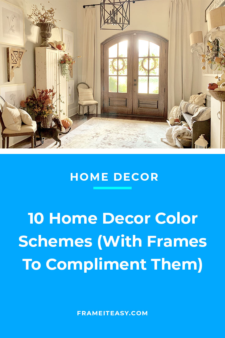
We’re sharing 10 of our favorite tried and true home decor color schemes to give you some inspiration for planning your next space. And be sure to make note of how our favorite frames are used to complement said home decor color schemes!
Our Favorite Home Decor Color Schemes
1. Brick and Gold

Brick itself offers a textured and rustic alternative to plain drywall. Pair your brick features with bright metallics, like gold, and your home decor color scheme will look good in just about any space!
Consider incorporating other neutral tones, such as gray, blue, or black, to complete the color scheme. Your brick tones will make any other color stand out.


2. Black and Honey

The black-and-honey color scheme provides a softer alternative to a classic black-and-white pairing. The boldness of black furniture and pieces will be highlighted by bright whites and honey tones.
Find accessories that are similar shades to the honey tones and incorporate them into your decor! However, use black pieces sparingly, to preserve the dramatic and eye-catching effect of the shade.
3. Teal and Cherry

Teal and cherry might not be the first color combination that comes to mind, but it certainly is one to consider for any space you’re designing! Certainly utilize monochromatic tones — same color, different shades — as well as patterns in your design. Teal and cherry home decor color schemes are eye-catching and bold, perfect to make a statement in your home.
So look out for fun and dramatic accessories and pieces of art to highlight this eccentric color combo. Our Hanover metal frame in red is a particularly great match for this color scheme.
4. Navy and White

Navy and white home decor color schemes are perfect for any modern or contemporary interior design. After all, the colors are clean, and simple, as well as provide tons of contrast against each other.
Rather than accessorizing with items of similar hues, consider choosing pieces with bright or metallic tones, in order to provide even more contrast to the color scheme. Our Hanover metal frame in shiny gold is a great match for this color scheme — thin and simple, but providing a bright eye-catching accessory.
5. Slate and Orange

For all of our eclectic or modern design enthusiasts, a slate and orange color combination is a great choice for your space. Of course, utilizing various colors and patterns goes well with these two tones. Therefore, experiment with purples, wooden items, and pieces with bold patterns!
Our shiny gold and silver frames complement this eccentric color combo, but definitely browse our various frame styles if you’re looking for even more color!
🌻 Free Vintage Nature & Flower Prints!💐
🥀 Download Free Art Here! 🌺
Subscribe to our mailing list for exclusive goodies, fun quizzes, framing tips and tricks, and so much more!
6. Green and Wood

The first thing that comes to mind when you see green and wood home decor color schemes is the tranquil and nature-inspired design. Green and wood color combinations are perfect for farmhouse-style interiors, but can really complement any design style you’re after!
Utilize other shades of brown and green to add depth to your design, and of course, find wooden pieces that provide character and texture to your space.
We recommend our Bradford black metal frames for this design. Simple enough to not take away from the delicate green and wood color scheme, but bold enough with its thicker edges. Alternatively, accessorize with our Derby wooden frames or Dayton wood frames, of course contributing to the wood side of our color scheme.
7. Bright Whites

Despite not being two distinct tones, taking advantage of different shades of white certainly can be its own home decor color scheme. Rather than putting an emphasis on the bold colors of different furnishings, a bright white color scheme will utilize predominately white tones and cream accessories and pieces.
The emphasis in the space will be placed on minor accessories and pieces that add texture. For example, what you choose to frame will have a big impact on the room, whereas in spaces of more dramatic color schemes this has less of an emphasis placed upon it. In addition, opt for items of varying textures, perhaps touches of metallic items.
To complement the white tones, we suggest utilizing any of our white picture frames. On the other hand, if you have pieces that are all white and cream and you’re looking for that bit of texture and boldness that the room needs, check out our metal frames which come in various colors.
8. Honey and Gray

Honey and gray home decor color schemes are a soft and simple combination that will lighten up any space you incorporate them into. The addition of similar light-toned accessories will complement this color scheme nicely.
Consider touches of metallic items — this will add some texture and boldness to your space. However, have caution with straying too far from the shades of honey and gray. This color scheme promotes an airy vibe, and you don’t want to add too much boldness to your space.
Our Derby frames in honey, of course, are the perfect fit for this color scheme. They not only define this color scheme but soften the space and make it feel like home.
9. Wood and Black

Wood and black color combinations are bold and dramatic — they make a big statement in any room you incorporate them into. They lend a more masculine and earthy feel to the space, however, you have many options for pairing other accent colors with them.
Feel free to explore different gray tones, green, or red accessories in the space. Wood and black home decor color schemes are extremely versatile, and there are many tones that pair nicely with this combination.
We recommend styling your photos and art with our Stafford black metal frames, or our Derby wooden frames. If you don’t have a ton of wood in your design initially, perhaps ramp it up with various wooden frames. Whereas if you have an abundance of wood in your space, accessorize with our thicker-edged black metal frames.
10. Black and White

They say opposites attract, and that certainly holds true when it comes to black-and-white home decor. Black and white might just be the simplest home decor color scheme to achieve, as you don’t have to consult various shades and hues.
Be sure to incorporate some gray tones in your accessories, and even consider adding pieces of bold color that will stand out among your blacks and whites.
Are You Red-dy?
Hopefully, you’ve gained some ideas and inspiration for choosing home decor color schemes for your next project. Remember, it doesn’t end with choosing two colors, it’s important to vary your accessories with complementary or monochromatic tones.
Color schemes are what make your spaces so personal, and even a single item can make a difference in your area. Make a statement with your color combinations, or opt for a softer more airy feeling when choosing your colors. Whatever the case, make it yours!
Lastly, keep in mind that you can always use picture frames to accessorize or highlight a certain home decor color scheme that you’re after. Here at Frame It Easy, we offer a variety of frame styles and colors for you to explore and incorporate into your design. Ready to add a picture frame display to your home? Check out our gallery wall themes and arrangements to show off with your chosen decor color scheme!