Most people pick a matboard color the way they pick a paint swatch: squint at a handful of options, guess, and hope for the best. That’s fine if you’ve only got a handful of options to guess from. We don’t think you should have to guess at all, especially not when we’ve built the largest matboard color selection in the industry and a tool that tells you exactly which one is right before you order.
Why Matboard Color Selection Actually Matters
A matboard isn’t just a border. It’s the thing that decides whether your art breathes or gets swallowed. The wrong mat color can wash out a print, fight with a frame finish, or clash with the room it’s hanging in. The right one does the opposite: it pulls a color out of the piece you didn’t even notice was there, and suddenly the whole thing looks intentional.
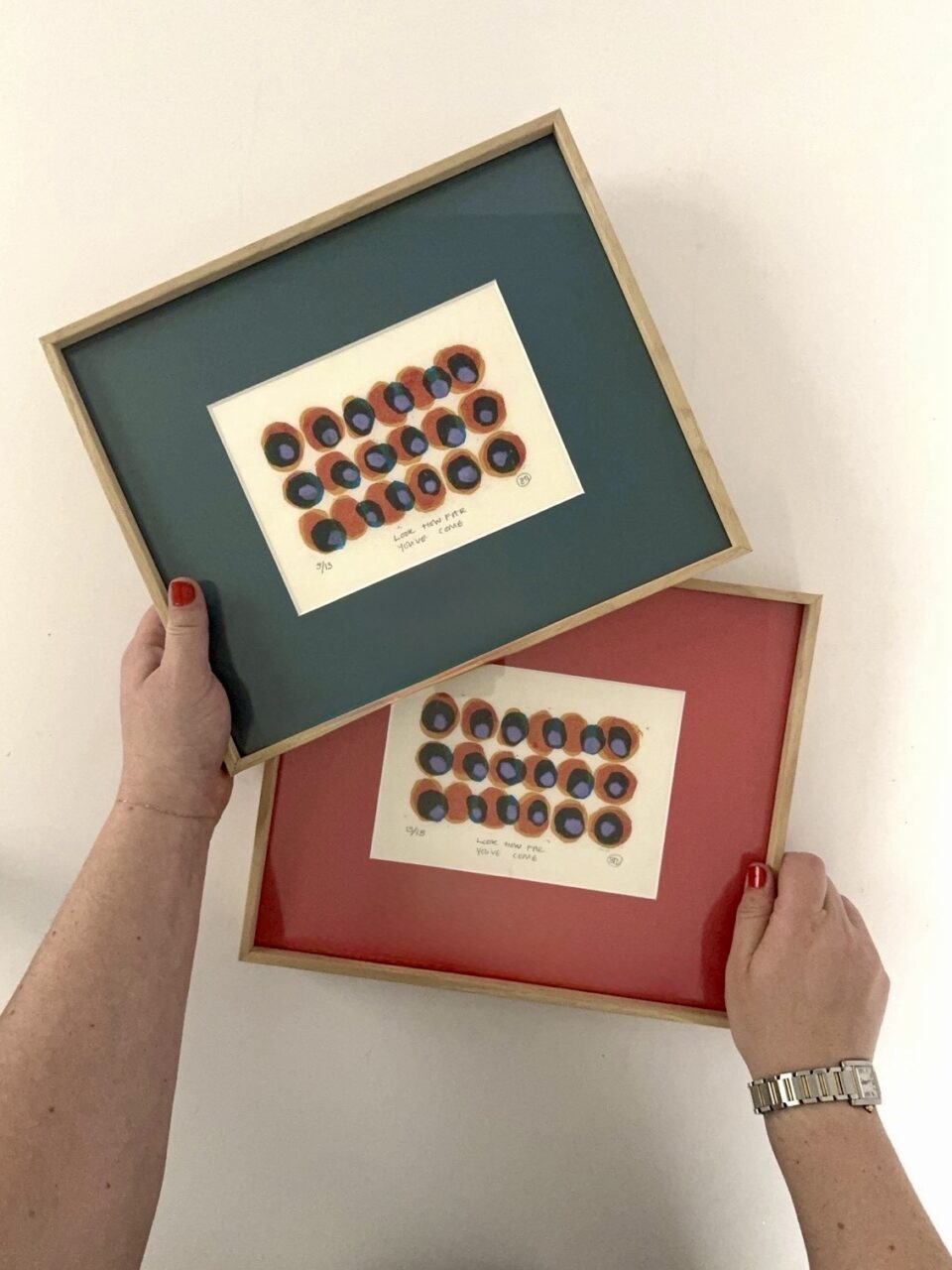
That’s true whether you’re framing a single photo for your hallway, matching client artwork to a designer’s palette, or matting fifty prints for a gallery show and needing every single one to look cohesive. Color is doing more work than people give it credit for. So the selection you’re choosing from, and the tool you’re choosing with, matter a lot more than “pick white or don’t.”
We Have More Matboard Colors Than Anyone Else in Framing
Here’s the brag, stated plainly: nobody in custom framing supplies more matboard colors than we do. Not the luxury framers, not the mass-market shops, not your local frame store. We built our matboard offerings to be the largest in the business, on purpose, because “pick from these ten colors” was never good enough for people who actually care what their art looks like.
Accessible doesn’t mean generic, and custom doesn’t mean expensive. Those two ideas usually get treated like a tradeoff. We treat them like a promise. You shouldn’t have to choose between having real options and having an easy, affordable process. Our Smart Color Matching tech was built to prove you don’t.
What “Unlimited Colors” Actually Gets You
A bigger library isn’t a flex for its own sake:
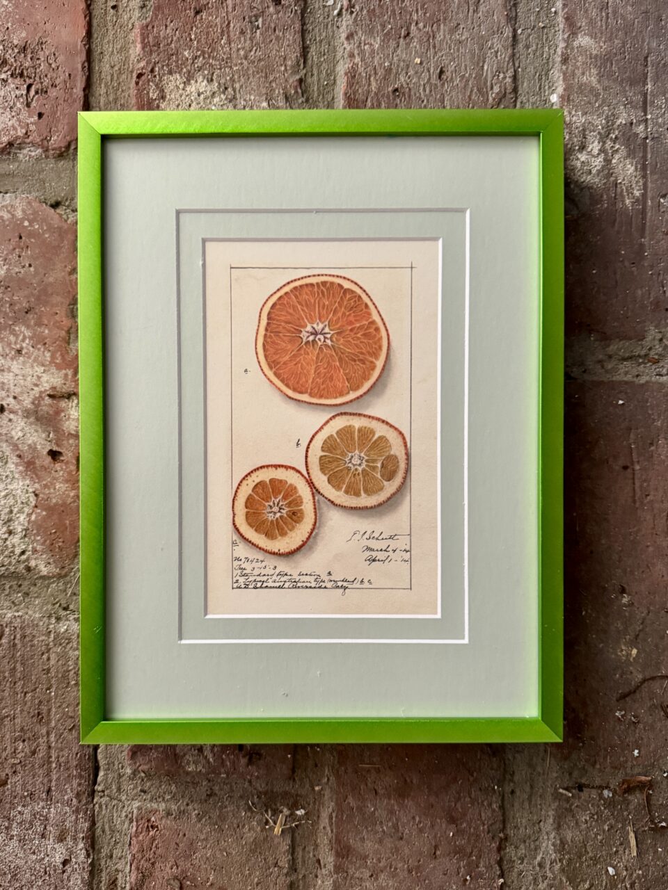
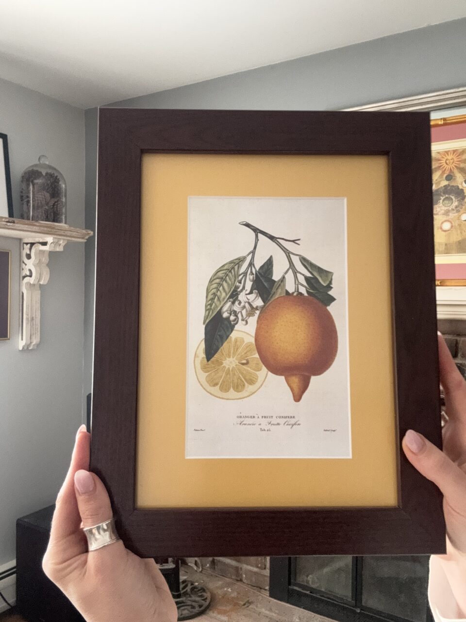
- Real nuance, not just primary colors. Dusty sage instead of “green.” Terracotta instead of “orange.” The in-between shades are where most art actually lives.
- Metallics and museum-quality options alongside infinite colors, available as well without leaving the site.
- A shade for every intent. Whether you want the mat to blend right in or do some of the talking, there’s a color built for that job.
More colors only matter if you can actually find the right one without losing an afternoon to it. Which is exactly the problem the next section solves.
Smart Color Matching: How We Make Endless Choice Actually Usable

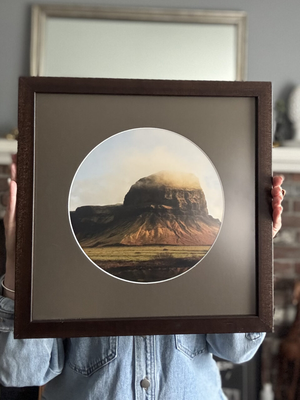
Having the largest matboard color selection is a big responsibility! A huge color library with no way to navigate it is just a wall of swatches. We did way better than that. That’s why we built Smart Color Matching that turns our full matboard selection into a fast, confident decision instead of an overwhelming one.
What Exactly Is Smart Color Matching?
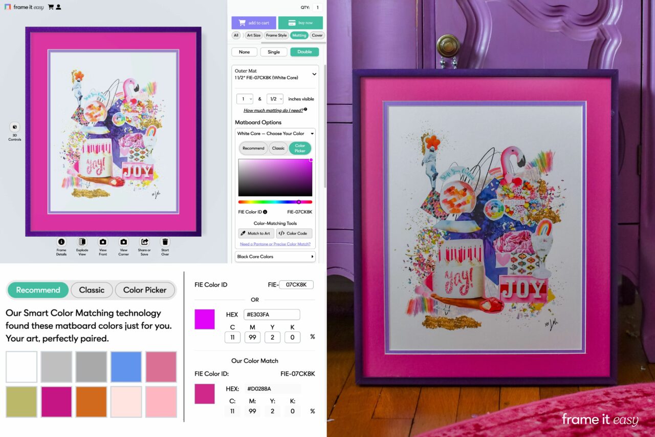
Smart Color Matching is our color-matching technology designed to take the guesswork out of matboard color decisions. This works for art you’re uploading yourself or framing a piece you already love. It helps you pick mat colors that complement your artwork (even if you don’t have design experience) and feel confident that your art, matboard, and frame work beautifully together.
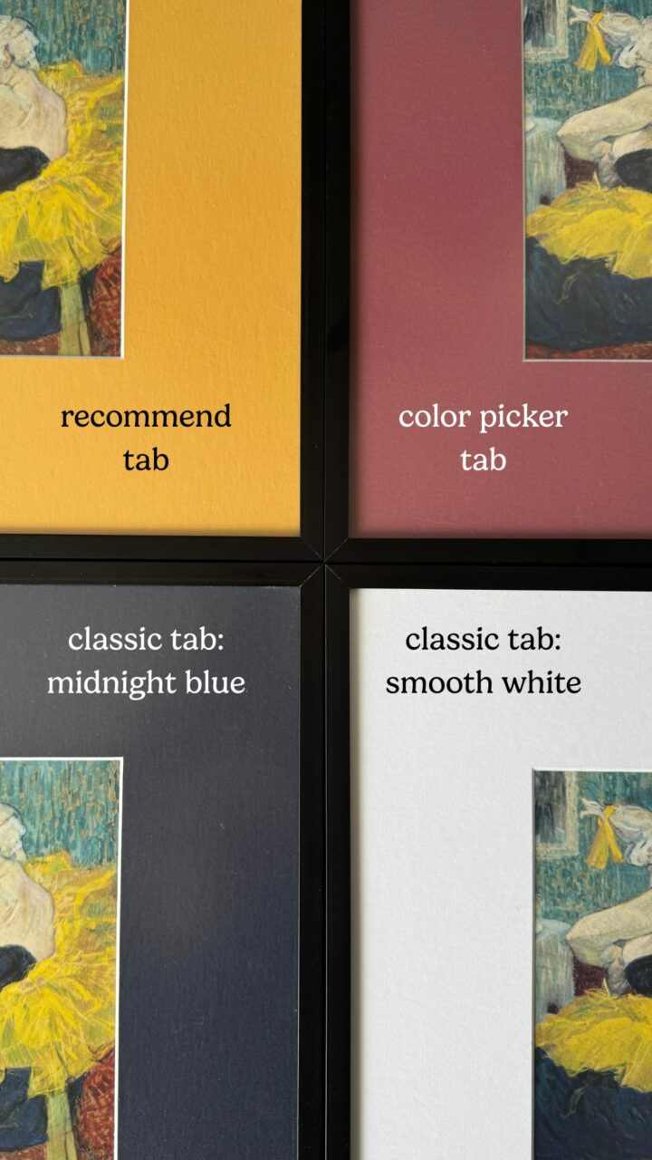
You can explore your options through three tabs:
Classic
A curated set of timeless mat colors of every shade to get you going. Perfect if you want to see some color swatches as an easy starting point.
Recommended
Not sure what you want? We’ll guide you with up to 10 color suggestions based on your artwork, helping you land on a perfect color, no guesswork required.
Color Picker
The fan fav! Feeling creative? Explore the full range of mat colors and fine-tune your design until it feels just right. Ideal for dialing in a specific color from your art or matching a space.
That third option is where things get interesting for two groups in particular: artists who need to hit one specific color every time, and designers who need full creative control down to the last detail. We’ll get into both.
Match to Matboard To a Color Code
Entering a color code is the fastest route when you already know exactly what you’re after. Instead of eyeballing swatches and hoping something works, you type in the hex or CMYK value you’re working from, whether that’s a brand guideline, a paint chip, or a color pulled from an old order, and our system matches your matboard to it directly. No back-and-forth, no guesswork.
A technical callout worth knowing: Hex codes describe digital colors (what shows up on a screen), while CMYK describes print colors (what comes off a printer). We match your matboard as closely as possible to whichever value you give us, but because you’re translating a color from a screen or a printed page onto physical matboard, there can be a slight difference between what you see on screen and what arrives in hand. That’s true of any color-matching process, digital or physical. You can always order a sample from our matboard page if exact color fidelity is critical to your project.
For Artists: Matching an Exact Color, Every Time
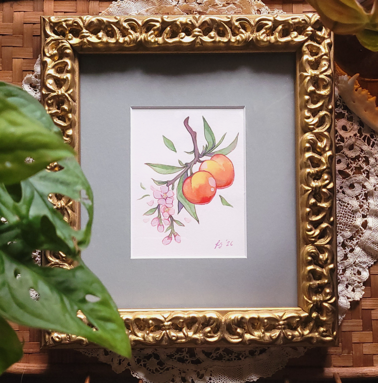
If you’re an artist reselling framed work, prepping for a show, or fulfilling a batch of prints in varying tones, consistency is what actually matters. You need the same color to show up the same way, whether it’s frame one or frame fifty, and you need to land on that color reliably, even if you’re matching an old sample, a past order, or a brand palette that has to stay consistent.
That’s exactly what Smart Color Matching’s exact-match mode is built for. If you’re framing at any kind of volume, our Bulk Frame Order Planning Guide walks through how to plan a multi-frame order so every piece comes out consistent, color included.
For Interior Designers: Full Creative Control at the Detail Level
Designers don’t want fewer decisions; they want more control over the ones that matter. When a client’s space has an established palette, “we have blue” isn’t precision; it’s a starting point for an argument. You need the blue, matched to spec, every time you order.
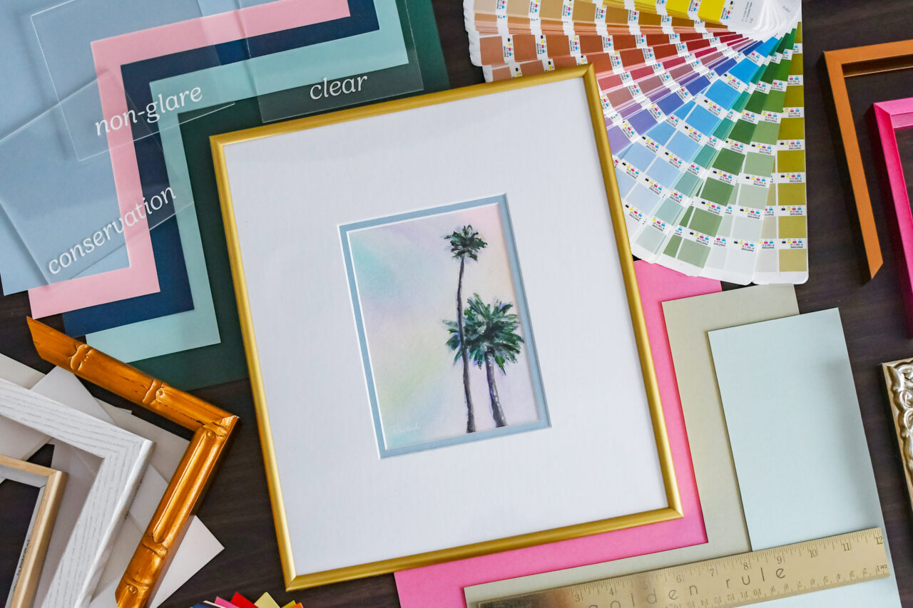
Smart Color Matching gives you that level of control without slowing down your process. Match matboards to an exact brand color, a room’s existing palette, or a client’s specifications, and get it right on the first try instead of ordering a sample and hoping. For the full picture on how we support designers and brand teams working across multiple spaces or rollouts, take a look at our Brand Color Matching guide.
Frequently Asked Questions
How many matboard colors does Frame It Easy offer?
More than any other custom framer. Our matboard library spans standard colors, metallics, patterns, and museum-quality conservation options, all searchable and matchable through Smart Color Matching.
Can I match a matboard to an exact Pantone or hex code?
Yes. Smart Color Matching includes an exact-match mode where you can enter a hex or CMYK value and get a matboard matched precisely to it. Pantone matboards are available upon request.
Is Smart Color Matching free to use?
Yes, it’s built directly into our 3D Frame Designer at no extra cost, so you can explore and match colors before you commit to an order. If you’re looking for an exact Pantone match, some fee may apply.
Do interior designers get support for ordering at scale?
Yes. Designers and brand teams working across multiple projects or locations can get consistent, exact-match matboard colors on every order. See our Brand Color Matching guide for the details.
Your Art Deserves the Right Color, Not Just Any Color
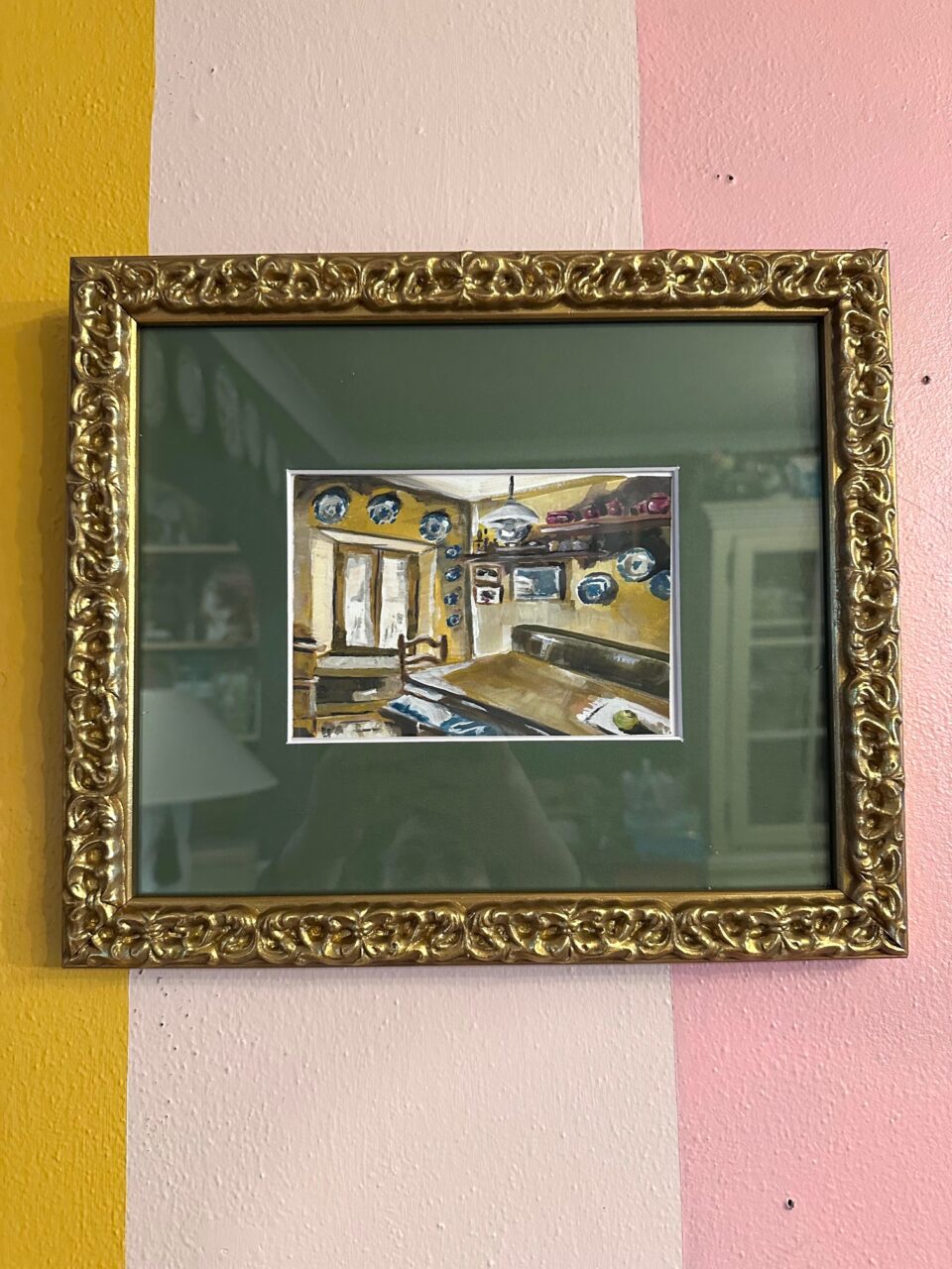
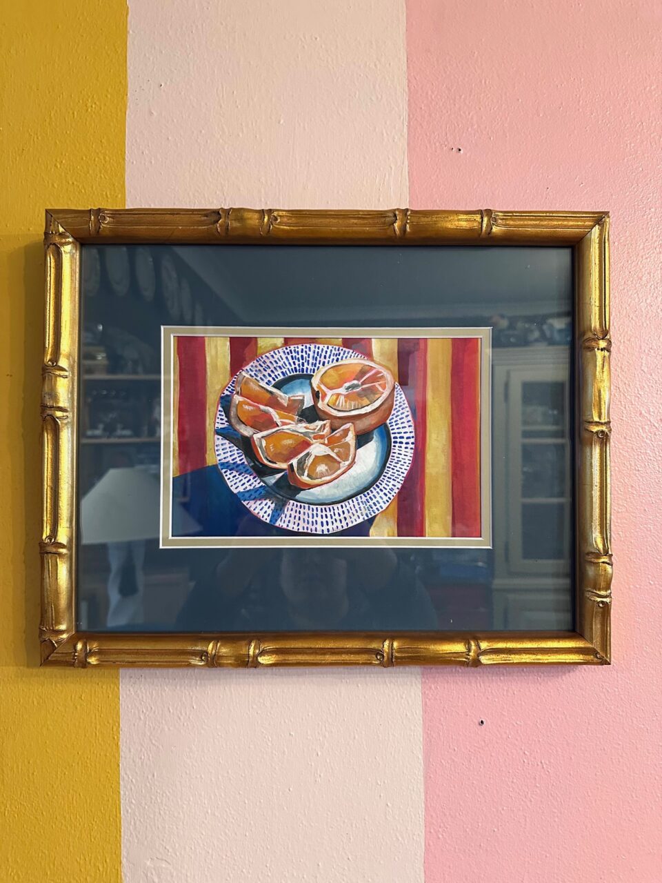
A bigger matboard color selection only matters if it gets you somewhere. Ours does. Whether you’re matting a single print for your living room, matching a client’s brand color to a T, or keeping fifty frames consistent for an art show, we’ve got the deepest matboard library in the business and a tool built to help you actually use it.
So where do I start?
Start by choosing something you have been meaning to frame, and playing with the matting options to see it in full effect. We guide you every step of the way, giving you the confidence to properly frame your photos and art prints, It’s that easy!