Need some inspo adding frames to your home? We’ve got 10 perfect picture frame ideas for you to add to every room in your house!
When it comes to home decor, picture frames are often an underestimated staple piece – even the smallest frame has the ability to transform any space! These versatile and fashionable pieces not only showcase your cherished memories but also add a touch of personality and style to your living spaces.

House Decor Made Easy
Have you ever walked into a room that felt a little “blah”? Was it the furniture? The lighting? Maybe you couldn’t quite put your finger on it. 🤔
Chances are the walls were barren! Nobody wants to look at a blank wall all day – think about your workspace, wouldn’t it feel like a jail cell without decor and some homey comforts? We think so! Luckily, adding a personalized frame or two can really lift the mood.
We love frames for home and office decor because of their durability, you can move them around, change out artwork, and display them on a shelf or wall. They’re also incredibly affordable and easy to install (we do all the hard work for you!) – Just open your Frame It Easy package, grab a hammer, and hang your frame with our hanging hardware set, so easy!
Office
The office is where we go to get work DONE! So naturally you want your environment to be upbeat and motivational. Bright colors, motivational quotes, and fun patterns are perfect for this space.
We recommend creating a gallery wall of framed inspirational quotes to proudly display all of your creative and academic achievements. Another great idea is to make a staggered gallery wall vision board to remind yourself of what you’re working towards!
Picture Frame Ideas: Photo Inspo


🔥Hot Tip: Keep your office space upbeat and uncluttered! Crisp colors, a clear desk, and minimal distractions will not only improve your mood but will help you get more work done!
Kid’s Room
Fuel your little one’s imagination by working together to create a fun and playful space. Not only is this a great bonding experience but also a chance to boost their self-esteem by framing things like artwork, report cards, and favorite family and friend photos.
Make it even more fun by incorporating a rotating gallery into their bedroom – this way they can change out their frames to display their current favorite images and works.
Picture Frame Ideas: Photo Inspo


Nursery
Creating a serene and calming environment in a nursery is key! Baby will be spending most of their time sleeping here after all. Framing sweet images like baby animal illustrations, family photos, and lullaby quotes add a peaceful vibe – perfect for babies to look at while they drift off to sleep!
Pair your images with delicate colors and frames. Pastel and gold hues create warmth and comfort, which is why our Granby in Gold frame is one of our most popular nursery frames!
Picture Frame Ideas: Photo Inspo


Kitchen
The kitchen is all about good food and good vibes! Add your own personal touch by framing family recipe cards, vintage food ads, or special photos. Go for a rustic vibe with a wood frame or keep a clean industrial kitchen (Yes, Chef!🫡) with sleek metal frames!
Keep in mind, that the kitchen can get messy and hectic, so opt for a frame that can be easily cleaned in case of a culinary mishap. Sometimes messes happen, which is why we created the ultimate frame cleaning guide!
Picture Frame Ideas: Photo Inspo


Master Bedroom
Turn your bedroom into a romantic and sleepy haven. Incorporate calming hues like baby blues, rose pinks, and light grays to create a soft atmosphere. Displaying your most treasured photos, letters, and other sentimental frameables adds warmth and can bring about happy thoughts when drifting to sleep or relaxing.
Bring more warmth to the room with metal tones like our Ashford style frame in Rose Gold, Satin Gold, or Gloss Gold.
Picture Frame Ideas: Photo Inspo


🌻 Free Vintage Nature & Flower Prints!💐
🥀 Download Free Art Here! 🌺
Subscribe to our mailing list for exclusive goodies, fun quizzes, framing tips and tricks, and so much more!
Master Bathroom
We all want that spa-like luxury incorporated into our own bathroom! Elevate your master bath’s ambiance with a few plush towels, fresh plants, and a framed image or two – think serene landscapes or botanical prints.
While frames are not waterproof or moisture-resistant, you can display them in well-ventilated areas of your bathroom like by the door, over a vanity, or on a supply shelf.
Picture Frame Ideas: Photo Inspo


🧐 Is it safe to hang art in my bathroom? Make your bathroom a stress-free decorative zone and learn about hanging artwork in risky areas.
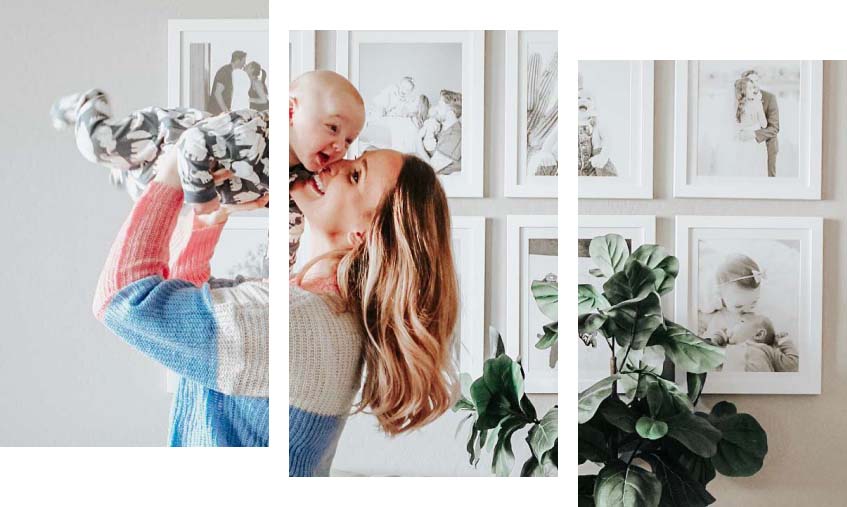
Living Room
The living room is the heart of the home, the family focal point, where everyone comes together to relax after a long hard day. By arranging a mix of family photos into a gallery wall you’re really putting the “family” in the “family room”!
In this space, we often recommend “go big or go home” as the living room or family room is often the space where most gatherings happen. So create a beautiful family wall display for the perfect conversation starter when guests and family arrive at the home.
Picture Frame Ideas: Photo Inspo


Dining Room
Create an elegant fine dining experience with rich colors like wine reds and vibrant yellows. Consider framing vintage silverware sketches, food photography, or your favorite vintage spirits ad. We recommend choosing frames that complement your dining table’s aesthetic. Wood frames for rustic wood tables and metal frames for more industrial or modern table settings.
Picture Frame Ideas: Photo Inspo


Guest Bedroom
Make your guests feel at home with a crisp and clean bedroom layout. Opt for scenic photos, abstract paintings, or minimalistic illustrations. We generally recommend sticking to two to three colors within the room to create this fresh look.
Consider using simple classic frames like our Hanover Style in Gloss Silver or Satin Silver. This rounded metal frame goes with almost all aesthetics and wall colors.
Picture Frame Ideas: Photo Inspo


Guest Bathroom
Transform your guest bath into a cozy retreat by displaying framed travel photos or welcoming quotes. If your guest bath is on the smaller side opt for a small frame and tiny art. It may be small, but can give the room that extra bit of elegance!
Frame styles like Granby in Gold and Dayton in Umber housing small floral or landscape images can add a warm homey touch to your guest bath and make your visitors feel more at home.
Picture Frame Ideas: Photo Inspo


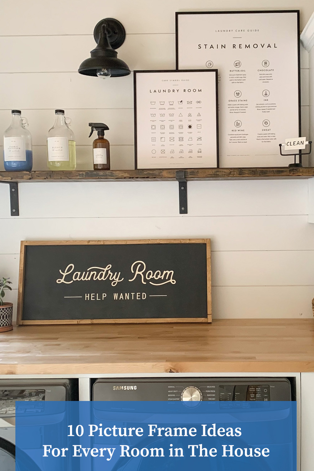
Bonus: Laundry Room
No one likes doing laundry, but if you are going to spend some time folding bedsheets it might as well be in a beautifully designed space! We recommend framing laundry guides like stain removal recipes and clothing tag symbol meanings, Even cute and quirky quotes work to help keep your spirits up while doing the dirty work!
Simple frames like our Ashford in Gloss Black or Bradford in Satin Silver will not only match your washing appliances but keep a sleek and clean look – perfect for a washroom!
Picture Frame Ideas: Photo Inspo


Final Thoughts
Here at Frame It Easy, we like to think of picture frames as the unsung heroes of interior design, capable of turning any room into a work of art. And, with these 10 picture frame ideas for every room in the house, it’s easy to see why! From the home office to the laundry room, you can infuse each space with your own unique style and personality – with just a photo and frame!
We hope these ideas have inspired you and sparked some creative redecorating ideas, so go ahead, unleash your creativity, and let your walls tell your story! 🖼️

Show off your framed artwork, photos, & other items! – Inspire others by sharing your photos, tell us your story! If we share it, you’ll receive a coupon for 15% off your next order!
Be sure to follow us on our socials for more daily inspiration – check out our Shopify app to start selling your own framed prints!