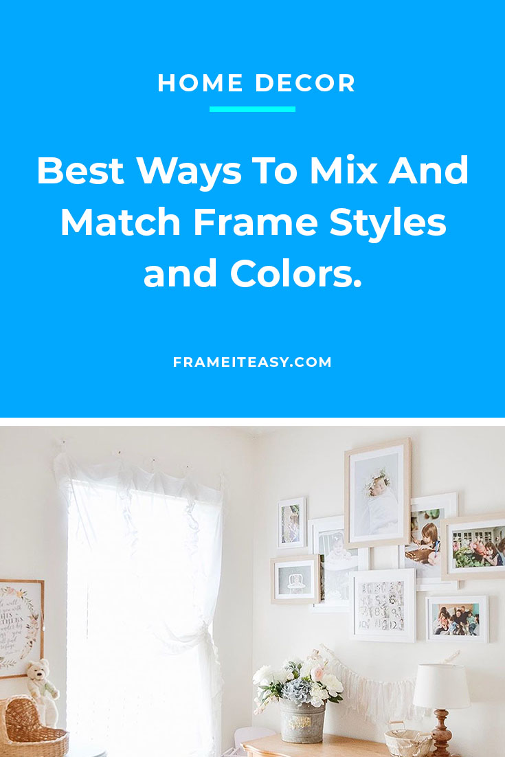
A lot of customers use our custom framing service to make gallery walls. Often, they opt for using matching frame styles and colors across multiple pieces to make a classic, uniform display; and, yeah, the result is always amazing. But did you know you can mix and match frames for that extra visual appeal?
At Frame It Easy we know that the opposite approach works too — combining frame styles and colors to make a more unique, patchwork look. Sometimes a variety of colors hanging on your wall create an eye-catching presentation in unexpected ways.

If you’ve been a customer with us for a while, you know that we believe your choices should be based on your personal preference, and what we post as inspiration are just suggestions, not set in stone. But if one of our suggestions spark a creative flame, we hope you decide to go for it!
We’re going to take you through some basic ideas to consider when you’re trying to create a multi-frame display with different styles or colors, just in case your inspiration needs a boost.
Try To Alternate Colors

Creating order amongst different hues is never a bad idea. And if you tend to like the classic symmetrical style but want to venture a little out of your “normal,” this might be the way to go. Use the same size for both frame and matting, but switch out the frame color. That way, the profile of the frame stays consistent, but the contrasting color gives each photo a slightly different personality. You just want to make sure that the matting color you choose works well with each of the frames. Of course, you can never go wrong with a classic white mat. But feel free to use our interactive site to experiment with the different mat colors we offer.
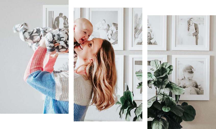
Color Coordinate Your Overlapping Frames

We’ve talked about the overlap frame look on our gallery wall guide; it’s classy, modern, and a great way to make certain photos just jump off your wall — literally.
A way to make this already great look work even better is by color coordinating which frames rest directly on the wall and which lay on top. Maybe even do something where the darker-colored frames are on the bottom, and the lighter ones are on top, or vice-versa, just as a way of playing with perspective.
🌻 Free Vintage Nature & Flower Prints!💐
🥀 Download Free Art Here! 🌺
Subscribe to our mailing list for exclusive goodies, fun quizzes, framing tips and tricks, and so much more!
Mix and Match Frames With Metal and Wood Styles

Our white frame styles can go with just about anything. We love how simple they look with white matboards for a uniform look, but we’re not opposed to adding a pop of color in the matboard as well. However, we love the way white and gold frames look so elegant together.
Mix it up with wood and metal frame styles, or keep it the same with all metal. Either way, you have yourself a display that all your friends will be talking about and complimenting you on.
Consider Color Combinations When Framing

Playing with color elevates the look of your display. Understanding complementary colors is a great place to start when experimenting with color combinations.
For example, if you’re choosing a gold frame, green and navy matting makes a stunning combo. If you’re framing black and white photos, the possibilities are endless. Any mating or frame color matches the simplicity of black-and-white. Mixing pink and black frames is a great way to make your darker frames pop as well. You could also take the alternating color idea from the first section and combine them — making a display with one pink frame, one black, and then one pink again! You could also take the alternating color idea from the first section and combine them — making a display with one pink frame, one black, and then one pink again!
Do All Your Photos Have The Same Theme? Try Color Coordinating to Match!

Let’s say your photos all have the same idea or theme. This could be a bunch of different members of the same sports team scattered throughout different pictures or nostalgic photos from you and your friends during your college days — and you want to get frames with your college colors as an homage.
Consider the photo above, too — three photos of some patriotic-looking fireworks with their respective red, white, and blue frames. This could be a great idea to create uniqueness among the frames while maintaining uniformity in theme.
We have lots of colorful frames, but don’t forget, you can use this same idea with colored matting!
It’s Eclectic! Mix and Match Frame Sizes, Colors, and Styles

Patterns can be predictable sometimes. And maybe you want to create a hodgepodge of different frames. This would be great if you have a bunch of photos with a fairly universal color palette, so they would be versatile as to what frames they would match well with.
Note the image above; all the frame colors, styles, and sizes are different. And there’s not much order to how things are arranged. Still, it just sort of, well, works.
Think About What You’re Framing Before The Overall Display

The overall display is definitely something you want to think about. But your first priority should be thinking about how each print would look in its respective individual frame. This should influence how you carry out mixing and matching frames.
Do you want only two frame styles, but one picture doesn’t quite look right in either? Well, think about doing something a little different with that one. As you saw in our last section, a patchwork of different frames can be pulled off as well.
Use Our Resources
Here at Frame It Easy, we ensure you have all of the framing resources needed, right at your fingertips. If you are still uncertain about how this will all look, don’t forget you can upload your desired image and experiment with different matings and frames. This gives you plenty of opportunity to play around with mixing and matching your frames.
We are also here to help answer all of your questions. If you’re not sure where to start, we provide help with everything you need to know about framing. What you frame, and how you curate your gallery wall can be a daunting amount of decision making. Alleviate any uncertainty by using our resources. Designing your gallery wall should be fun, so let us help you!
Want to Take it Up a Notch?

Are you left wanting more? Now that you have your frames, in the styles you like, and placed just so, consider thinking outside of the frames. What does this mean exactly? Find a color that pops out to you in one of your pieces. Consider painting your gallery wall to add more dimension (and possibly drama!) to your mixed and matched frames.
Don’t be afraid to make a bold move when it comes to design. Leveling up your wall with some color, or peel-and-stick wallpaper can set your home apart from others. After all, it’s only temporary! If you grow out of it or need a change after some time, it will be easy to do so.
Mix and Match Frames to Craft a Cohesive Look
Just like custom framing, how you actually hang your wall decor is completely up to you. No matter how you choose mix and match frames, it only matters that you like it. These are just some of our color scheme suggestions for you to try at home.
Of course, if you have any ideas that you think would beat ours, reach out to us or tag us in a post on Instagram; we’d definitely want to see it. And if you have any questions, reach out to us. We are here for you!