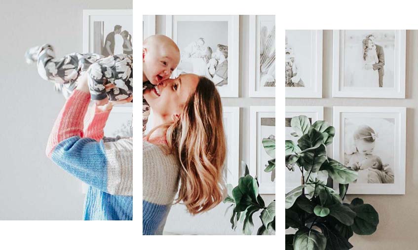
When it comes to framing, what we have deemed color confidence is what gives you the tools to turn a good piece of art into a finished, intentional statement. Black and white frames are popular for a reason, right? They’re familiar, neutral, and feel safe.
But safe isn’t always the same as right.
It’s the difference between defaulting to what you’ve always done and choosing what actually works best for your artwork. Color confidence doesn’t mean bold for the sake of bold. It means understanding how color supports art, knowing where to experiment, and having the right tools to guide your choices. And we can help!


Why Do We Tend To Play It Safe With Frames and Matting
Framing decisions feel permanent. Once something is on the wall, it’s easy to worry that a colorful choice might feel overwhelming or dated over time. And that’s when black and white frames become the fallback, not because they’re always the best option, but because they feel like the least risky one.
The reality is that most artwork or photos already contains color, warmth, and nuance. When frames and matting are limited to black or white, those details can get lost instead of being highlighted. And we can help!
Shop Our Colorful Picture Frames


Cyan

Violet

Lime

Berry

Yellow
What Color Confidence Really Means
Color confidence isn’t about making loud choices. It’s about making intentional ones. A well-thought-out color choice can look subtle. It might be a soft mat that pulls out a secondary tone in the artwork, a warm neutral that complements the photograph, or a bold red frame that adds contrast without stealing attention. When color is chosen with purpose, it supports the art instead of competing with it.


The Role of Matting in Color Confidence
Matting is often where color confidence begins. It acts as the visual bridge between the artwork and the frame, helping control balance, spacing, and mood.
A colorful mat can:
- Highlight details you might otherwise miss
- Add warmth or depth to cooler artwork
- Make minimal art feel more intentional
- Soften bold imagery without muting it
Because matting sits close to the artwork, even small color pops can have a big impact, making it the perfect place to experiment without committing to a bold frame.


Moving Beyond Black and White Frames
Black and white frames will always have their place, but they aren’t the only neutral options. Natural-toned wood frames, metallic finishes, and soft colors can act as quiet complements while still adding dimension.
Color confidence doesn’t require abandoning simplicity. It simply opens the door to more thoughtful choices that feel tailored to the art instead of being generic.
How Smart Color Matching Builds Confidence


Choosing a color is hardest when you’re starting from a blank slate. That’s why we developed our Smart Color Matching tech, to remove the guesswork and give you a confident starting point when choosing a matboard color.
Smart Color Matching gives you multiple ways to select a matboard color. You can explore your options through three tabs:
The Classic Tab
A curated set of timeless mat colors of every shade to get you going. Perfect if you want to see some color swatches as an easy starting point.
The Recommended Tab
Not sure what you want? We’ll guide you with up to 10 color suggestions based on your artwork, helping you land on a perfect color—no guesswork required.
The Color Picker Tab
The fan fav! Feeling creative? Explore the full range of mat colors and fine-tune your design until it feels just right. Ideal for dialing in a specific color from your art or matching a space.
By seeing intentional color options upfront, it becomes easier to trust your eye, compare possibilities, and move forward with a choice that feels right.
Seeing Color in Action Changes Everything
Color confidence grows when you can actually see your options. Viewing the same artwork with different mat colors quickly shows how much tone, balance, and mood can shift—without changing the art itself.
What once felt risky starts to feel obvious. And once you see how color works with your piece, it’s much easier to move away from default decisions.
When Black and White Still Make Sense

Color confidence also means knowing when to keep things simple. Some artwork benefits from a black picture frame or mat that stays out of the way. The goal isn’t to avoid black and white; it’s to stop choosing them automatically and be a bit more open to color. So if black or white is the best choice, it’s still a confident one, ot a just because one.
Confidence Looks Good on the Wall
Framing should feel creative, not stressful. Framing should feel creative, not stressful. With the right tools (like ours!) and a clearer understanding of how color works, choosing something beyond black or white becomes exciting instead of intimidating.
Color is not a risk; it’s a resource. And when you frame with confidence, it shows. So have some FUN, be color confident, and enjoy some new frames!