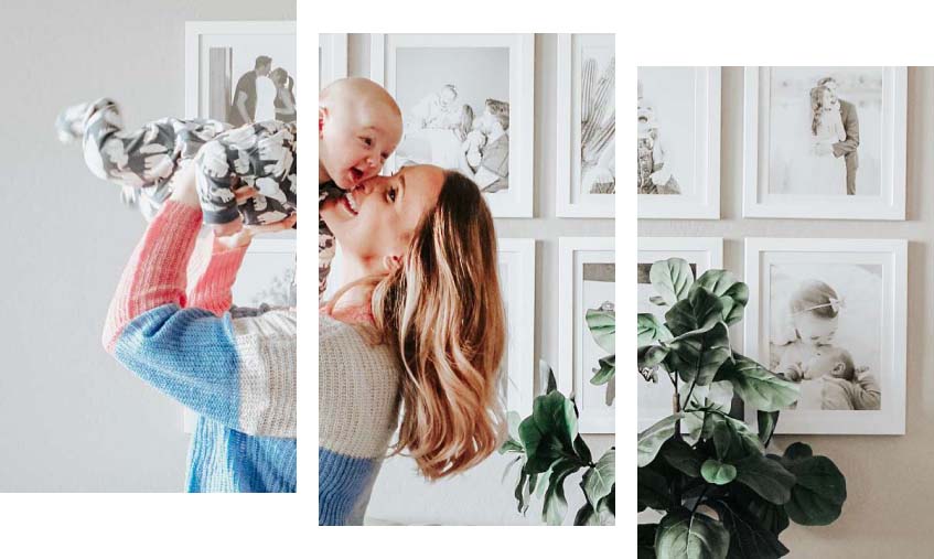
Smart Color Matching (SCM) takes the guesswork out of choosing a matboard color. Instead of scrolling endlessly through swatches, SCM analyzes the colors in your artwork and helps surface options that naturally work with it.
With Smart Color Matching, you can:
- View recommended matboard colors based on your artwork
- Use the color picker to pull a specific hue directly from the image
- Explore a curated palette that complements your art’s tones and contrast
This makes matting more intuitive — especially for first-time framers — while still giving you full creative control.
Smart Color Matching Tip
Not sure where to start? Begin with the recommended colors generated from your artwork. Once you find a direction you like, use the color picker to fine-tune your matboard choice by highlighting a specific accent or detail.
Classic Matboard Colors (And When to Use Them)

White and Off-White Mats
White mats are timeless for a reason. They keep the focus on the artwork and work well with almost any style.
Smart Color Matching helps identify subtle white variations so the mat doesn’t feel too warm or too cool
- Ideal for photography, illustrations, and minimalist art.
- Creates a clean, gallery-style look.

Black Mats
Black mats add drama and contrast, especially with lighter artwork.
- Best used intentionally to avoid overpowering delicate art
- Works well with bold photography or high-contrast pieces
- Can make colors appear richer and more saturated

Using Color Mats to Elevate Your Artwork
Colorful matboards can be incredibly effective when chosen thoughtfully. Rather than guessing, look for colors already present in the artwork.
A common approach:
- Use a dominant color from the artwork for a strong, cohesive look
- Highlight a secondary or accent color for added interest
- Let Smart Color Matching suggest colors you might not notice at first glance. We’re here for you.
Even a subtle strip of color (for your inner matboard) can dramatically change the overall presentation.
Double Matting for Depth and Detail
Double matting adds dimension and visual interest to framed artwork.
A popular combination:
- Neutral outer mat (white, off-white, or light gray)
- Inner mat that pulls an accent color from the artwork


This technique works especially well for:
- Illustrations and prints
- Artwork with fine details
- Pieces you want to feel more elevated or formal
Our 3D Frame Designer, paired with our Smart Color Matching tools, makes it easier to experiment with double mats without worrying about clashing colors or not liking the final result. Just keep playing!

Using the Color Picker for Custom Matboard Choices
The color picker allows you to select a color directly from your artwork and apply it to your matboard. This is especially helpful when:
- You want to echo a small detail or subtle tone
- The artwork includes multiple colors
- You’re creating a coordinated display across several frames
Pulling color directly from the artwork ensures harmony and avoids guesswork.
Did You Know? Matboard color can influence how bright or muted artwork appears. A well-matched mat doesn’t just frame the art — it can enhance contrast, depth, and overall color balance.
Metallic Matboards


Metallic matboards add immediate impact by reflecting light and drawing attention to your artwork. They’re a great choice when you want your framed piece to stand out and feel elevated.
We offer three metallic matboard options:
- Silver Metallic – cool, modern, and versatile
- Classic Gold – a deeper, bronze-toned gold for a rich, refined look
- Frosted Gold – a brighter yellow gold that feels warm and eye-catching
Metallic matboards work well with everything from pet photography to minimalist line art. Even a thin metallic border can add depth and dimension, helping transform a special photo or print into a true focal point.
Patterned Matboards

Patterned matboards are a creative way to add texture and personality to your framing while still keeping the focus on the artwork.
We offer several patterned options, including:
- Belgique Antwerpen – our most neutral pattern, perfect for adding subtle interest to black-and-white prints or simple photos
- Wood-grain patterns – Obsidian Blaze, Teak Trail, and Sandalwood, which bring warmth and a natural feel to framed artwork
Patterned matboards can complement minimalist artwork, such as thrifted art prints, or amplify bold, expressive pieces. If you’re framing a busy or energetic print and want to lean into that look, patterned mats can enhance the overall visual impact. While there are no strict rules, selecting a pattern that complements the artwork’s mood helps create a cohesive and intentional display.
Frequently Asked Questions About Choosing Matboard Color
How do I choose the right matboard color?
Choose a matboard color that complements your artwork, adds contrast, and supports the overall style of the piece. Smart Color Matching tools help identify colors that naturally work with your art.
How do I choose the right matboard color?
Choose a matboard color that complements your artwork, adds contrast, and supports the overall style of the piece. Smart Color Matching tools help identify colors that naturally work with your art
Should my matboard match the artwork or the frame?
In most cases, the matboard should relate to the artwork first. Pulling tones from the art keeps the focus on the piece while allowing the frame to support the overall look.
Can I use colored mats instead of white?
Yes. Colored mats can add personality and depth when chosen intentionally. Using colors already present in the artwork helps maintain balance.
What is Smart Color Matching for matboards?
Smart Color Matching analyzes your artwork and suggests matboard colors, including recommended options and a color picker, to make mat selection easier and more confident.


Choosing a Matboard Color Made Easy
Choosing the perfect matboard color doesn’t require design expertise — just a thoughtful approach and the right tools. By starting with your artwork, considering contrast and balance, and using Smart Color Matching to guide your choices, you can create a frame that feels cohesive, elevated, and uniquely yours.
Custom framing should feel empowering, not overwhelming — and the right matboard makes all the difference.